5 ways industrial venues add value to your wedding day!
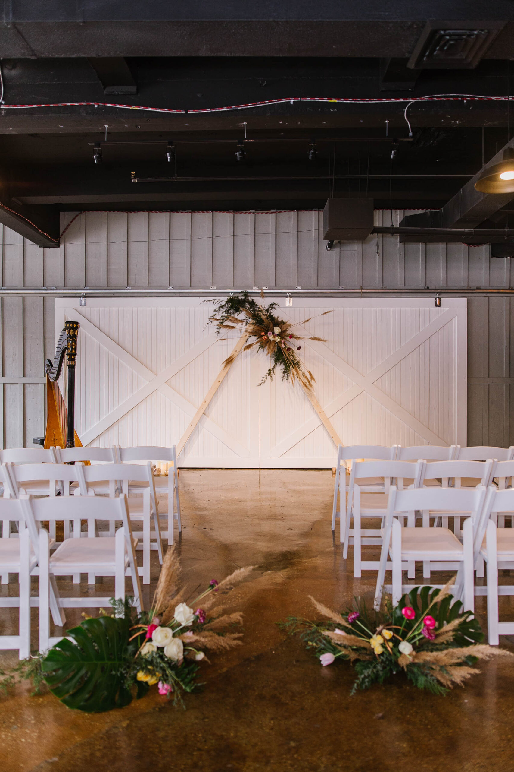
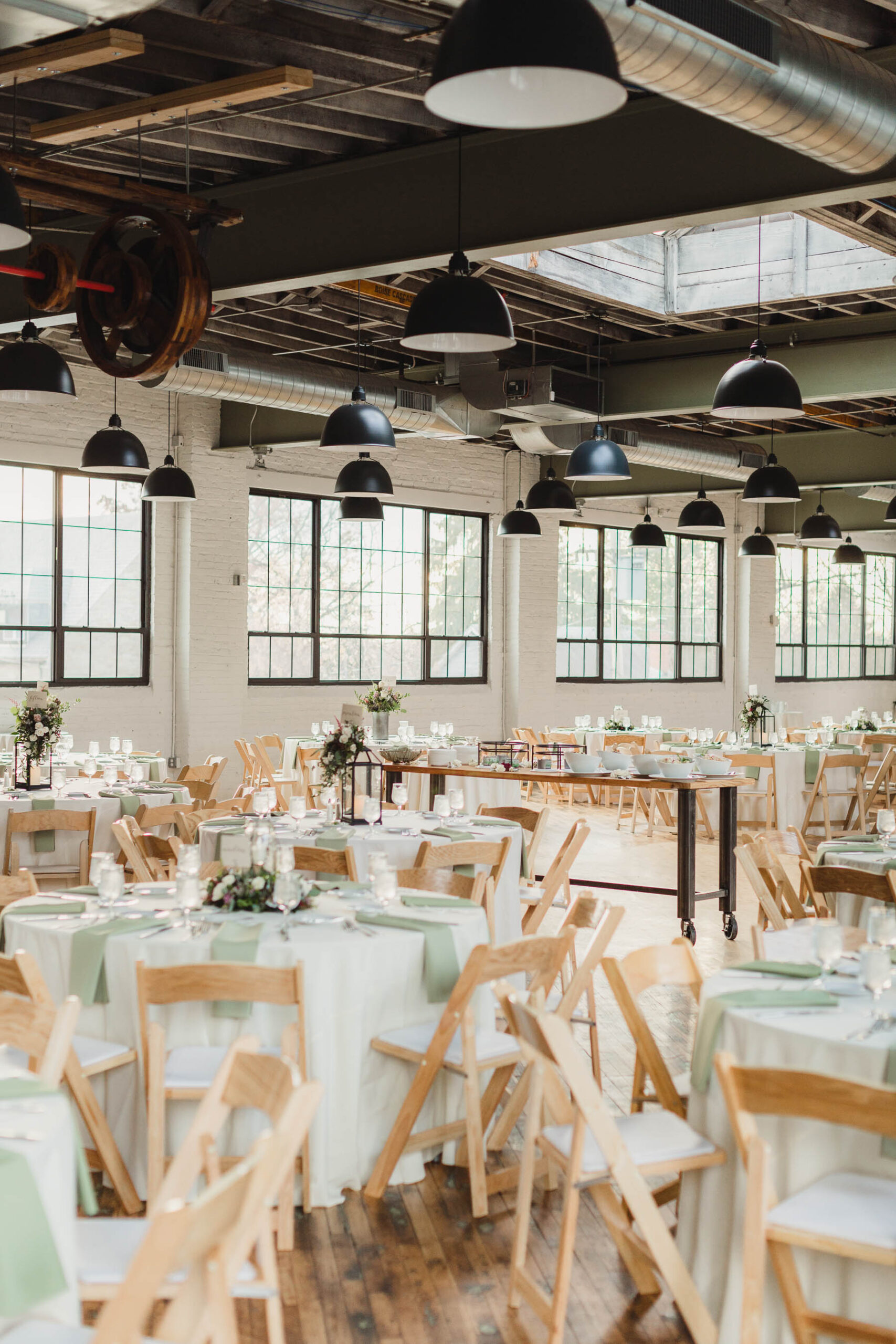
If you’re looking for a unique wedding venue, industrial / warehouse spaces are gaining popularity for a variety of reasons! One of my favorite is that spaces like this are great as a wedding venue because they really are a blank slate that can be customized and personalized to have as much or as little additional decor as you’d like; they really stand out and shine on their own and here’s why…
1. Industrial windows/openings/skylights = plentiful and playful natural light for flattering portraits
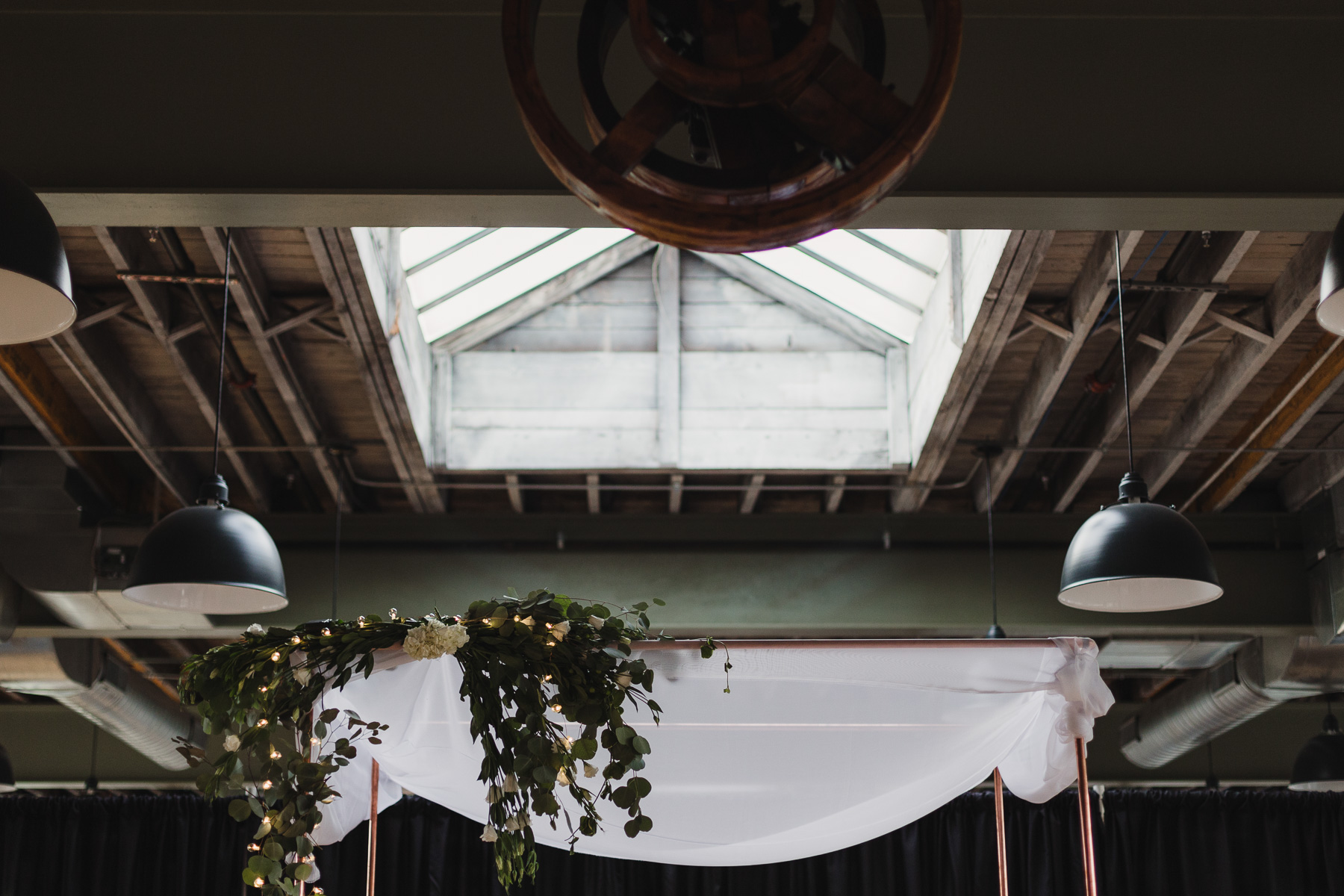
If there’s one common thread that makes most wedding day portraits successful and a photographer very happy, it’s natural light. When a space is filled with large windows and has multiple walls awashed in light, it means your photographer has greater opportunity to be creative in setting up flattering portraits and well-balanced detail shots. As the sun shifts throughout the day, the space can look and feel very different. It’s important to schedule your venue visit during the same season and rough time of day that you’ll be getting married, so you can see and understand how the light works in the space firsthand… you don’t want to be squinting or blinded as you’re reciting your vows!
2. Unique details on most surfaces = full of historic charm + character that can’t be found in recently constructed spaces
Ever notice that most old, historic buildings have layers upon layers of wood, brick, stucco, stone (or a combination of all of the above!) that make up their walls and floors? To me, that isn’t something to demolish and get rid of, it’s something to clean up and show off! The saying “they don’t make ‘em like they used to!” is SO true when it comes to buildings – why not use it to your advantage and celebrate marrying the love of your life within a place that has been around for decades (generations even!), stood the test of time and has a timelessness about it. There could be details within the entry doors, door handles, floor patches or original building signage that don’t exist anywhere else, even a piece of the building’s former life on display for all to see and learn from!
These venues usually have a presence that will make your guests pause and contributes to the overall feeling of what marriage is all about – being a part of something larger than yourself.
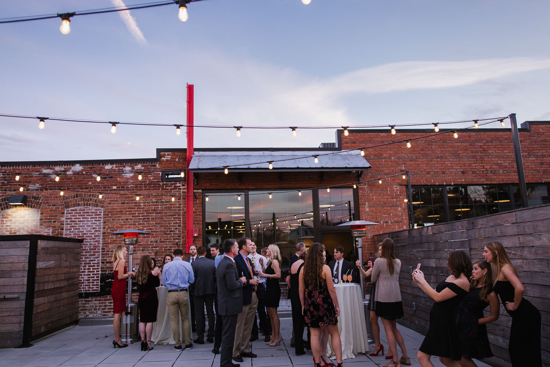
3. Large and expansive uninterrupted spaces = more flexibility and creativity for you and your wedding team
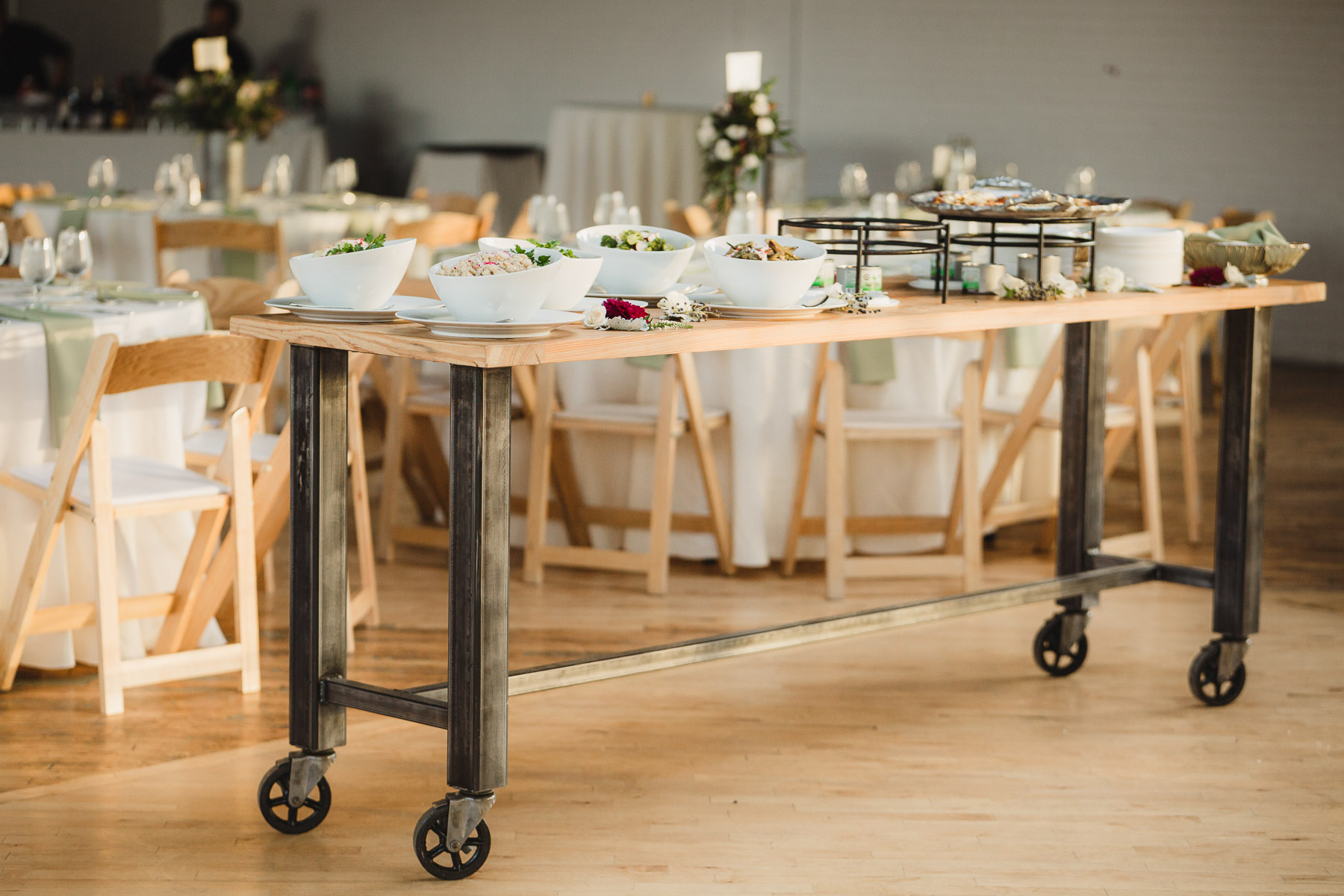
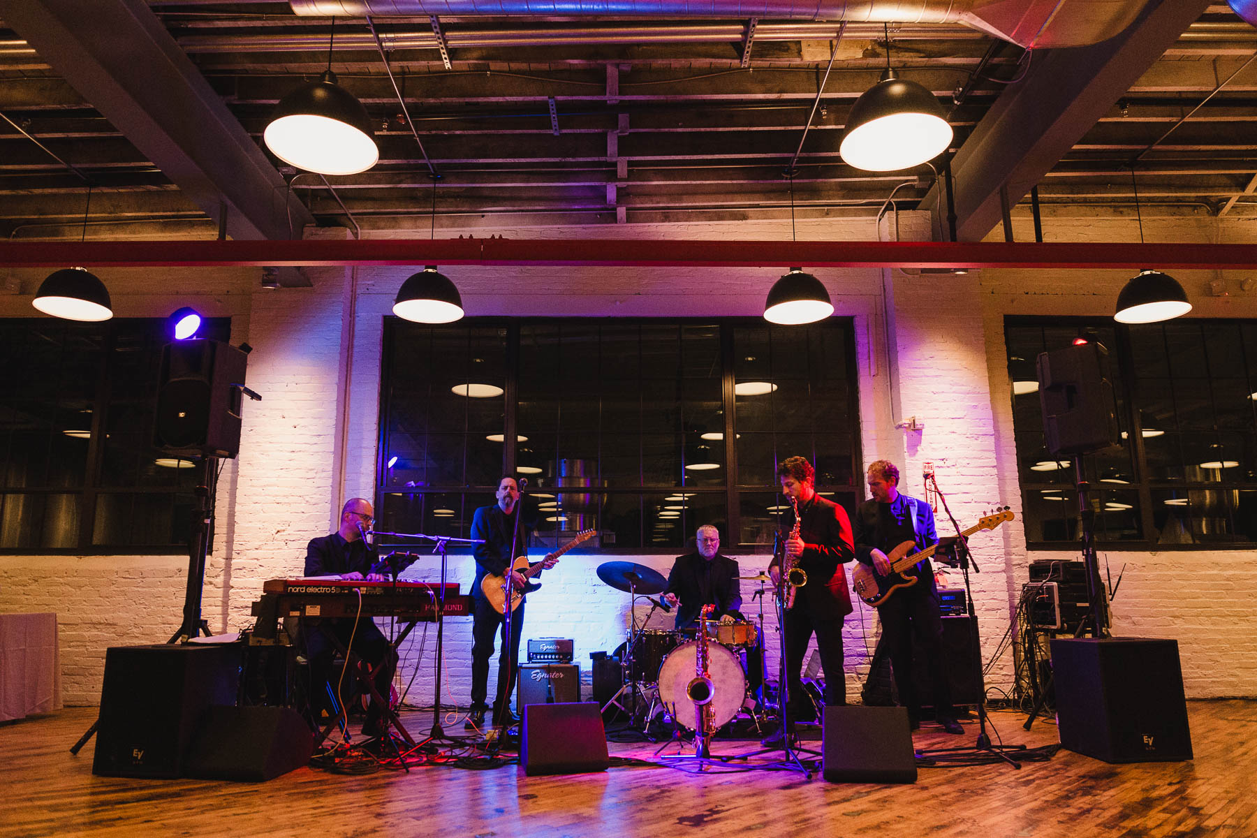
Warehouses and other industrial buildings that may have been a manufacturing or storage facility in a previous life, are some of the best spaces structurally speaking. They have steel columns and brick piers/walls which means a larger clear area without walls dividing up the space! What does that mean for you? A variety of table layouts are possible, the dance floor can be oriented in many different ways, more space for large bands, you might even be able to have enough space to not have to flip the room, but instead to have the ceremony on one side and the reception on the other. Creativity when it comes to draping can go a long way in making a large space feel softer and more inviting.
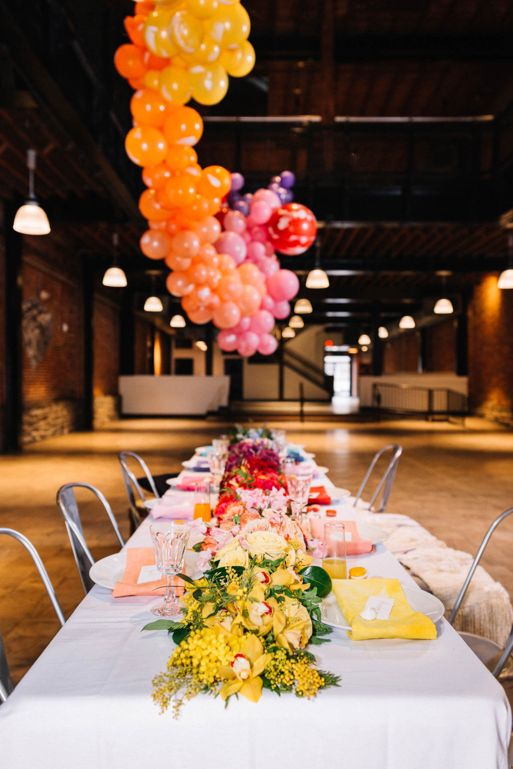
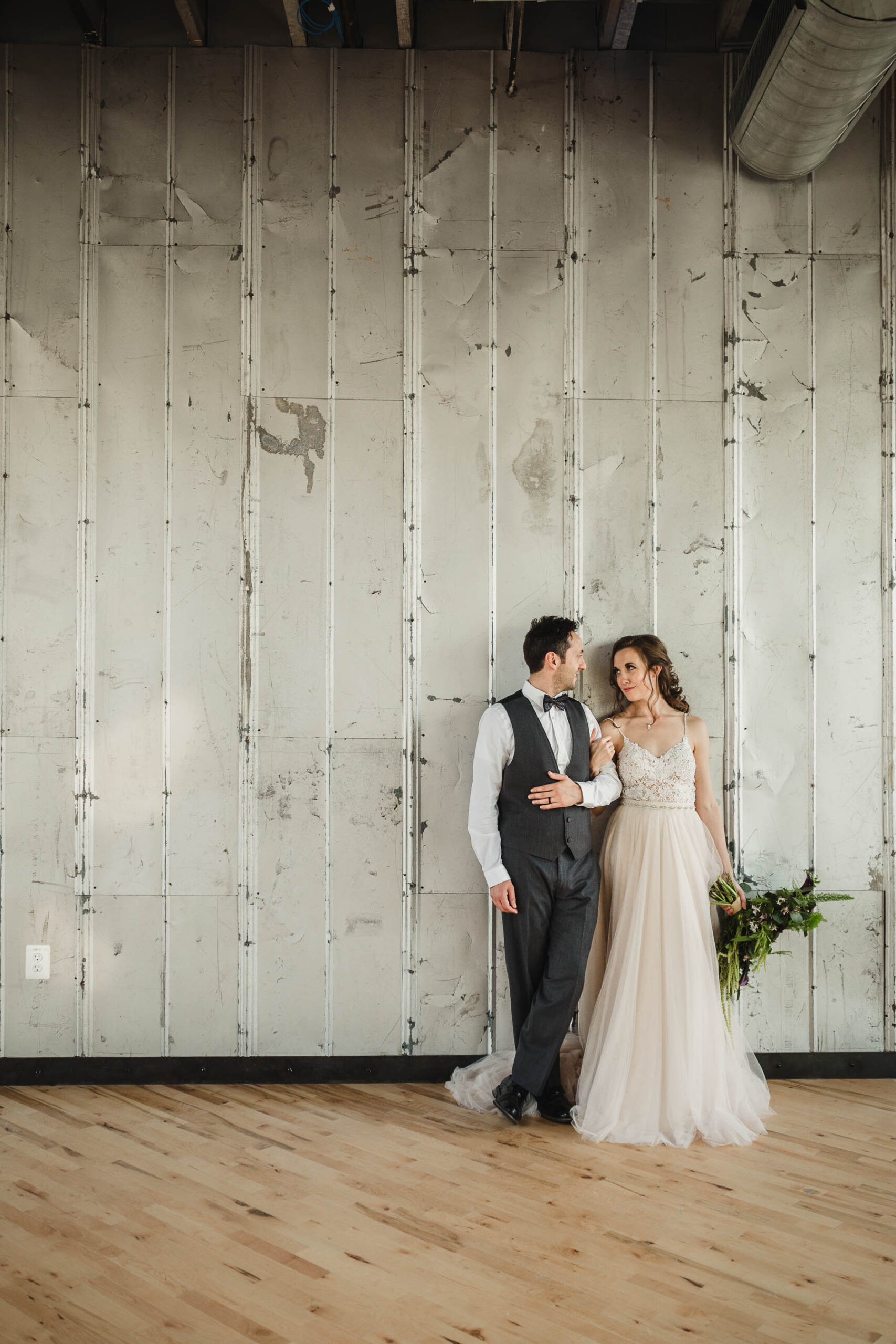
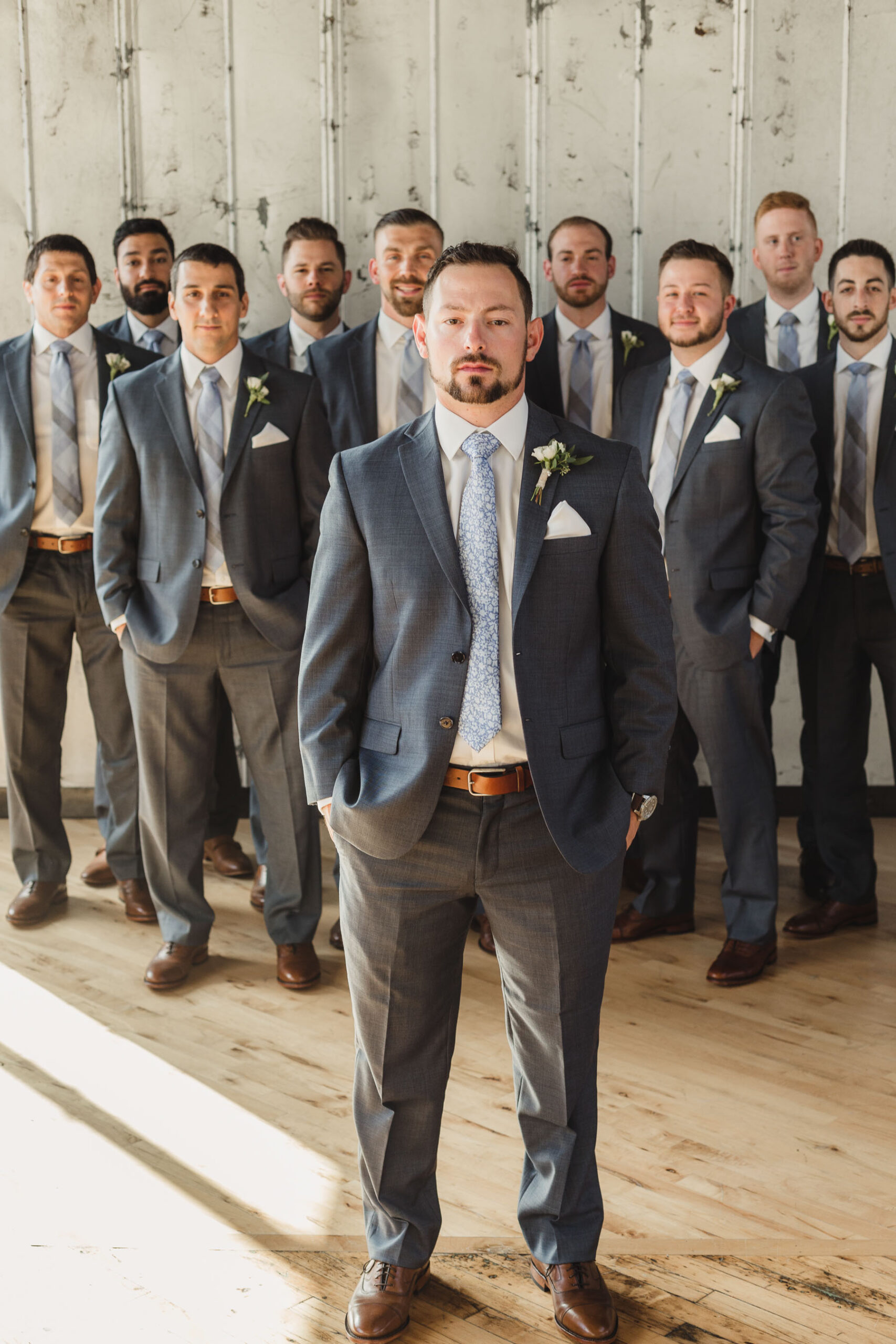
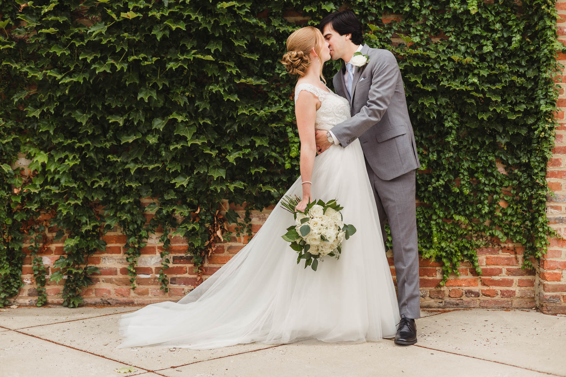
4. Whether it’s an oversized metal garage door, a mural, or an ivy-covered brick wall, urban environments can add such a unique feel to your portraits.
Manufacturing sites and port cities are what a lot of urban environments and downtowns are made up of. Why does that matter when it comes to event spaces? Because there are a wide variety of unique photo opportunities and backdrops for family portraits, first looks and exits among these types of spaces! I always like to look for simple backgrounds that don’t distract the viewer’s eye from the subjects in the photo but yet also have a strong compositional feel to add interest and vibrancy to the image. Think color, geometry, nature, leading lines and/or bold graphics as a way to allow your portraits to be fun and full of life, not just against a blank vanilla wall that could be anywhere USA!
5. Most industrial venues are essentially a blank slate with just the right amount of intrigue and texture to decorate minimally and have your decor efforts go a long way
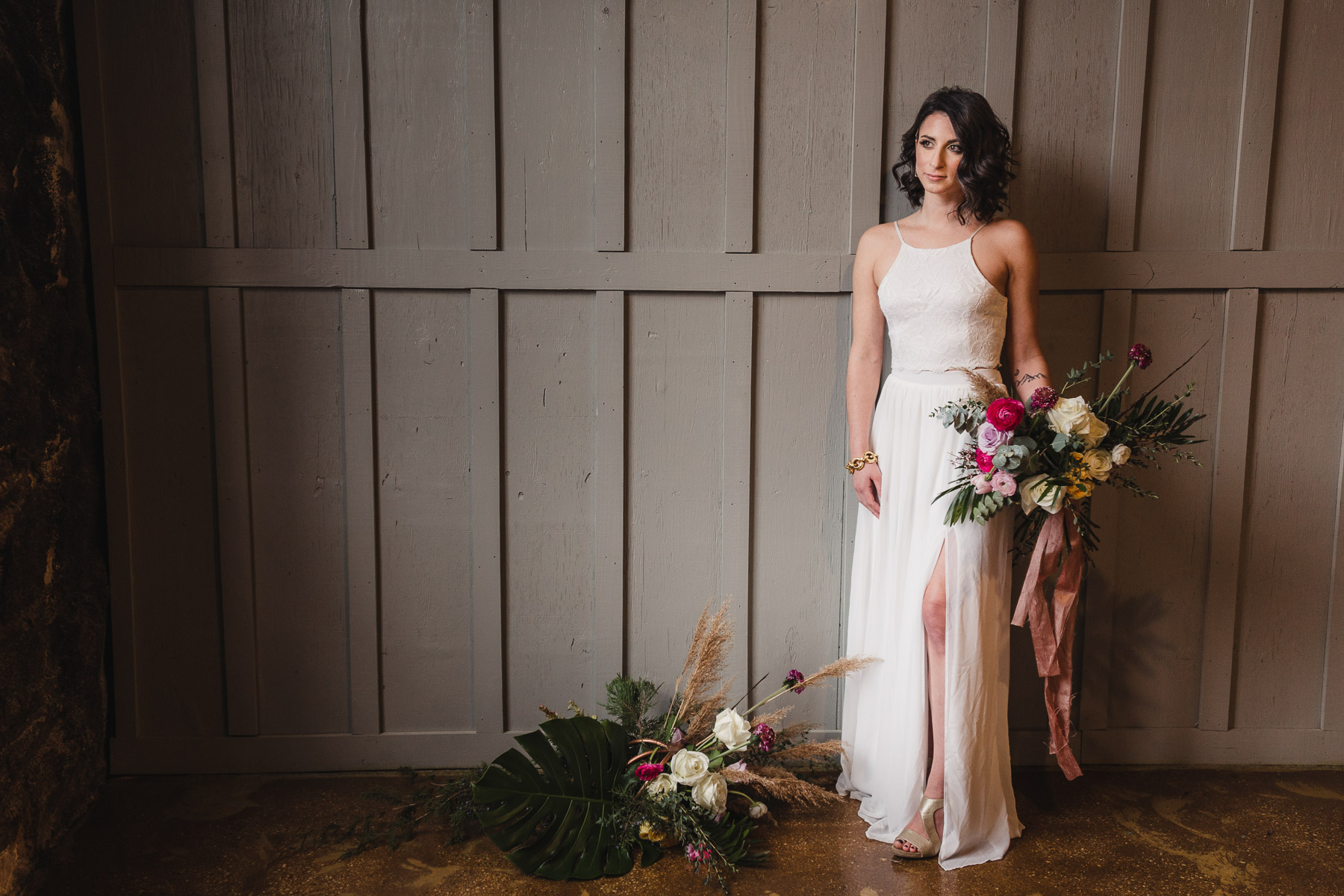
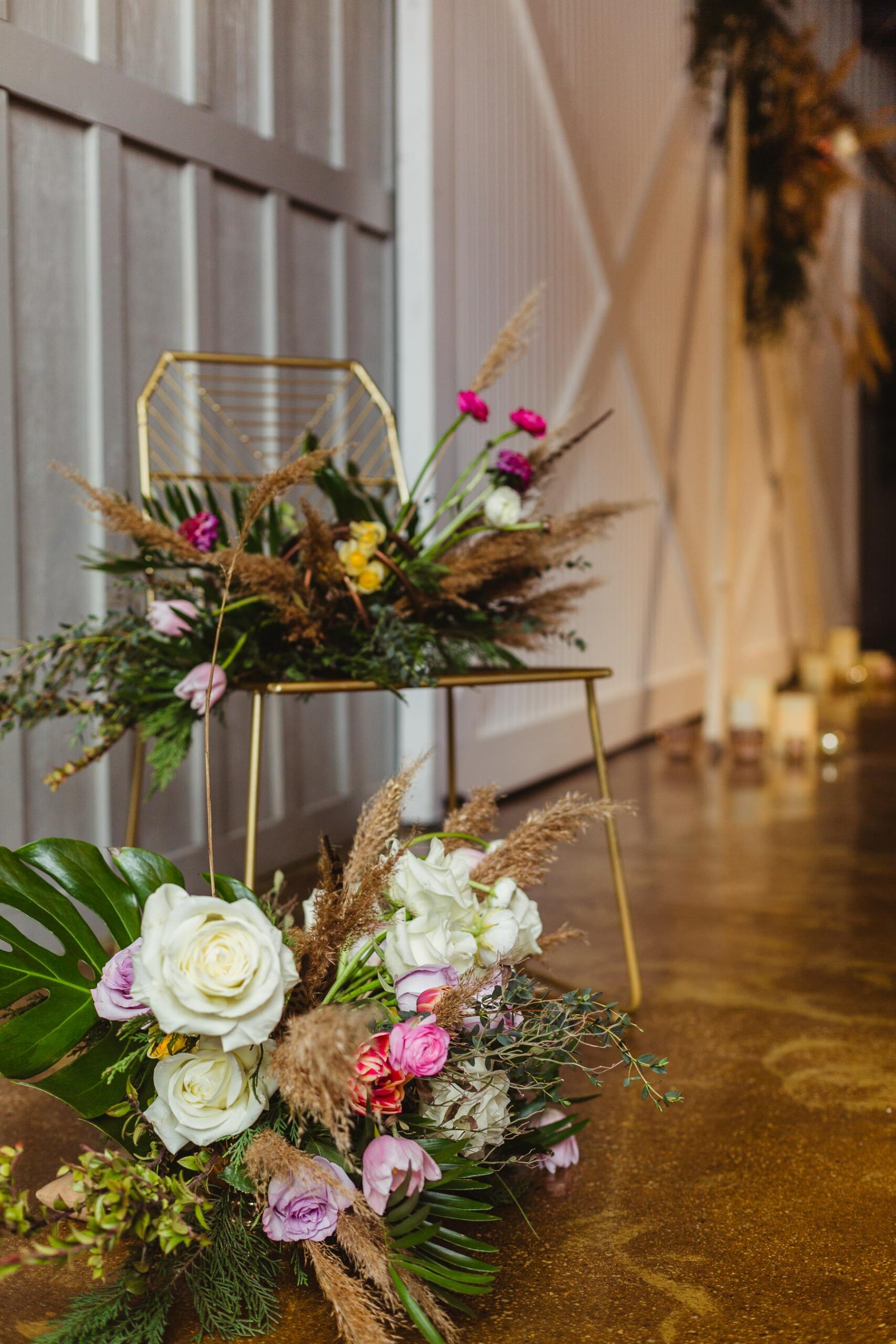
Since most of these types of spaces have been constructed out of brick or stucco, the color palettes are neutral (bonus when the brick walls have been painted white or gray lending texture but keeping the traditional brick coloring toned down!) and lend themselves to be great backdrops for adding pops of color of your own. Less is often more when it comes to establishing a classic and timeless look to your reception space – using cafe lighting and hanging floral, greenery, fabric or geometric elements are additional ways to add interest and height to a space that may otherwise feel bare!
